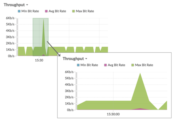
Zoom in on a custom time range
You can click-and-drag across a chart to zoom in on interesting metric activity. This custom time range is then applied across the ExtraHop system, which is useful for investigating other metric activity that occurred at the same time.
Zooming in on a time range is only available in charts with an x- and y-axis, such as line, area, candlestick, and histogram charts.
-
Release the mouse button. The chart is redrawn to the custom time range and the
time interval in the upper right corner of the navigation bar is updated.
-
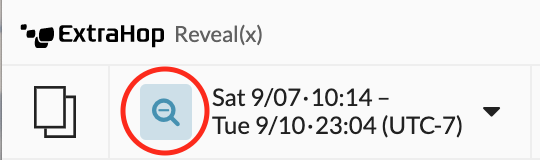
To revert from the custom time interval to your original time interval, click
the undo icon—a magnifying glass with a minus sign—which is displayed next to
the time interval in the upper right corner of the navigation bar.
Tip: On a dashboard page, you can limit the zoom-in custom time range to a specific region. Click the region header, select Use Region Time Selector, and then zoom in on a chart. Each chart or widget within that region is updated to the custom time range.
Thank you for your feedback. Can we contact you to ask follow up questions?