Charts FAQ
Here are some answers to frequently asked questions about charts.
This topic provides answers to frequently asked questions about how dashboard charts work in the ExtraHop system.
- How do I create a chart?
- How do I edit an existing chart?
- Which chart type should I select to compare data?
- Which chart type should I select to observe changes over time?
- When should I create a box plot, candlestick, or histogram chart?
- When should I create a heatmap?
- What are maximum, minimum, and average rates?
- Can I add trend lines to my chart?
- How do I add a rate to my chart?
- How do I change the units in my chart?
- How do I change a chart name?
- How do I change the labels in my chart?
- Why do I see icons on some of my charts?
- Why do I see Incompatible selections when I hover over a chart type?
- Why is there no data in my chart?
How do I create a chart?
- Create a new dashboard. An empty chart will appear in your new dashboard, which you can then edit with the Metric Explorer.
- Add a new chart to an existing dashboard by editing the dashboard layout. In the upper right corner, click the properties menu and select Edit Dashboard Layout. You can then add new empty chart widgets to your dashboard.
- Create a new chart based on a built-in chart from a protocol page. Click the chart title and select Create Chart from.... You can then save your chart to a dashboard.
How do I edit an existing chart?
You must have personal write privileges or higher and NPM module access to edit charts in a dashboard. Click on the chart title and select Edit. You edit a chart with the chart-building tool called the Metric Explorer. In the Metric Explorer, you select a source, protocol metrics to display from that source, and a chart type.
Which chart type should I select to compare data?
- Bar chart
- List chart
- Table chart
- Value chart
Which chart type should I select to observe changes over time?
- Line chart
- Area chart
- Column chart
When should I create a box plot, candlestick, or histogram chart?
Box plot chart: Displays the distribution summary of a single metric. You can compare different metrics such as processing time (for application latency) and round trip time (for network latency) side-by-side.
Candlestick chart: Displays changes to the distribution summary for a single metric over time.
Histogram chart: Displays the entire distribution for a single metric. Data is placed into bins instead of percentiles. Histograms help you quickly find outliers, because you can interpret the value of each bin, rather than interpret percentiles.
| Note: | Depending on the type of metric you select, you can view the distribution of metric activity as percentiles or as a mean and standard deviation. The box plot and candlestick charts display inner quartiles by default (5th, 25th, 50th, 75th, and 95th percentiles). Drill down on a timing metric to view the mean and standard deviation of a timing metric broken down by client, server, and other factors. |
When should I create a heatmap?
A heatmap displays a distribution of percentiles over time. You can only view timing metrics such as server processing time and round trip time in a heatmap. For example, a heatmap is useful for identifying concentrations of high server latency at a specific time.
What are maximum, minimum, and average rates?
Network byte and packet data can be displayed in a chart as a maximum, minimum and average per second rate. The Rate Summary in a chart displays these three rates together.
Configuring a chart to display the Rate Summary is only available for high-precision metrics, where metric data is aggregated into 1-second intervals. In the ExtraHop system, high-precision metrics are Network Bytes and Network Packets. For more information, see Display a rate or count in a chart.
Can I add trend lines to my chart?
You can add a dynamic baseline to your chart. A baseline is essentially a trend line that is calculated based on historical data. Baselines help you distinguish between normal and abnormal activity in your chart data.
The ExtraHop system does not begin calculating a dynamic baseline until the setting is enabled from the Options tab in the Metric Explorer. Therefore, dynamic baselines only appear for time periods that occur after the baseline was enabled. For more information, see Add a dynamic baseline to a chart.
You can also add a static threshold line to your chart. A threshold line helps you determine if activity is falling above or below a specific value, which is helpful for monitoring service level agreement (SLA) compliance. For more information, see Add a static threshold line to a chart
How do I add a rate to my chart?
Count metrics, such as errors, requests, and responses, are displayed as total counts in charts by default. But you can also display these metrics as a rate in a chart.
Below the metric name in the Metric Explorer, click Count, and select the type of rate to display.
For more information, see Display a rate or count in a chart.
How do I change the units in my chart?
Click the Options tab when editing a chart in the Metric Explorer. You can change units from bytes to bits, linear to log scale, or from the decimal prefix (1,000 bytes) to binary prefix (1,024 bytes). You can also abbreviate values in bar, value, and list chart types.
How do I change the labels in my chart?
You can rename metric labels that appear in the legend for most charts. Click on the metric label in the chart and select Rename. This option is not available for box plot, candlestick, heatmaps, or status chart types.
Why do I see icons on some of my charts?
Detection markers are displayed as icons on charts to indicate detections associated with the source of the metric data during the time interval specified for the chart.| Note: | Machine learning detections require a connection to ExtraHop Cloud Services. |
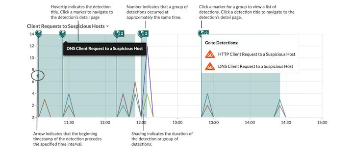
Hover over the detection marker to view the name of the identified detection, and then click the detection marker to navigate to the detail page for the detection for further investigation.
If multiple detections occur at approximately the same time, the marker displays the number of detections. Click the marker to display the list of detections, and click a detection title to navigate to the detail page.
If detections markers are not displayed on your charts as expected, check for the following issues:
- Your ExtraHop system is not licensed for the ExtraHop Machine Learning Service, which is required before you can see detections.
- Detections markers might be disabled. You can enable or disable detection markers from the User menu.
- You might be viewing a chart that does not support detection markers. Only the following
chart types can display detection markers:
- Area
- Line
- Column
- Line & column
Why do I see Incompatible selections when I hover over a chart type?
Some chart types are only compatible with certain types of metrics. When editing a chart, you might see an Incompatible selections message as you hover over a chart type. This message means that the metric you already selected is incompatible with the chart type.
- Heatmap
- Histogram
- Candlestick
- Box plot
These chart types are only compatible with timing metrics such as server processing time and round trip time.
Why is there no data in my chart?
There might not be activity for the source or protocol metric you selected for your chart during the time interval you selected. Adjust the time interval to see if data appears in your chart.
If you are not seeing the traffic you are expecting, contact ExtraHop Support for help.
Thank you for your feedback. Can we contact you to ask follow up questions?