Display percentiles or a mean in a chart
If you have a set of servers that are critical to your network, viewing the 95th percentile of server processing time in a chart can help you gauge how much servers are struggling. Percentiles are statistical measures that can show you how a data point compares to a total distribution over time.
You can only display percentile value and mean (average) calculations in charts that contain dataset or sampleset metrics. Dataset metrics are associated with timing and latency, such as server processing time and round trip time metrics. Sampleset metrics provide summaries of detail timing metrics, such as server processing time broken down by server, method, or URI.
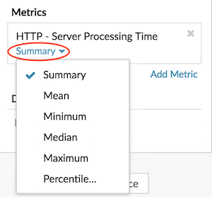
When editing a chart in the Metric Explorer, you can select percentiles or the mean by clicking the drop-down menu link below the dataset or sampleset metric name, as shown in the following figure.

The Metric Explorer provides the following calculations for displaying percentiles and the mean.
- Summary
-
For dataset metrics, the Summary is a range that includes the 95th, 75th, 50th, 25th, and 5th percentile values.
For example, each line in a candlestick chart contains five data points. If Summary is selected, the main body of the line represents the range from the 25th percentile to the 75th percentile. The middle tick mark represents the 50th percentile (median). The upper shadow above the body line represents the 95th percentile. The lower shadow represents the 5th percentile.
For sampleset metrics, the Summary displays the +/-1 standard deviation and the mean values. In the candlestick chart, the vertical tick mark in the line represents the mean, and the upper and lower shadows represent the standard deviation values.
- Mean
- The calculated average of data.
- Median
- The 50th percentile value of a dataset metric.
- Maximum
- The 100th percentile value of a dataset metric.
- Minimum
- The 0th percentile value of a dataset metric.
- Percentile
- A custom range of three or five percentile values for a dataset metric.
Display a custom range of percentiles
You can display a custom range of three or five percentile values for server processing time or round trip time metrics. You cannot display custom percentiles in a pie or status chart.
The following steps show you how to add a custom percentile range to an existing dashboard chart:
Before you begin
Create a chart and select a dataset or sampleset metric, and save it to a dashboard.- Log in to the ExtraHop system through https://<extrahop-hostname-or-IP-address>.
- At the top of the page, click Dashboards.
-
Launch the Metric
Explorer to edit the chart by completing the following steps:
- From the dashboard dock, select a dashboard containing the chart you want to edit.
- Click the chart title and select Edit.
- Click Summary below the metric name.
- Select Percentile... from the drop-down menu.
- In the Set Percentiles field, type a number for each percentile value, separated by a comma. For example, to view the 10th, 30th, and 80th percentiles, type 10, 30, 80.
- Click Save. Your custom range is now displayed in the chart. You can toggle between your custom range and other percentile selections, such as Summary or Maximum, at any time.
- Click Save again to close the Metric Explorer.
Filter outliers in histogram or heatmap charts
Histogram and heatmap charts display a distribution of data. However, outliers can skew how the distribution displays in your chart, making it difficult to notice patterns or average values. The default filter option for these charts excludes outliers from the data range and displays the 5th-95th percentiles. You can change the filter to view the full range of data (minimums to maximums), including outliers, in your chart by completing the following procedure.
- Click the chart title and then select Edit to launch the Metric Explorer.
- Click the Options tab.
- From the Default filter drop-down menu in the Filters section, select Min to Max.
- Click Save to close the Metric Explorer.
Thank you for your feedback. Can we contact you to ask follow up questions?