Chart types
Dashboard charts in the ExtraHop system offer multiple ways to visualize metric data, which can help you answer questions about your network behavior.
- To learn how a metric changes over time, select a time-series chart such as the area, column, line, line & column, or status chart.
- To learn how a metric value compares to a complete set of data, select a distribution chart such as the box plot, candlestick, heatmap, or histogram chart.
- To learn the exact metric value for a time period, select a total value chart such as the bar, list, pie, table, or value chart.
- To learn the alert status of this metric, select the list, status, or value chart.
Find more answers in the Charts FAQ.
The following table provides a list of chart types and descriptions. Click on the chart type to see more details and examples.
| Chart Type | Description | Type |
|---|---|---|
| Area chart | Displays metric values as a line that connects data points over time, with the area between the line and axis filled in with color. | Time-series |
| Column chart | Displays metric data as vertical columns over a selected time interval. | Time-series |
| Line chart | Displays metric values as data points in a line over time. | Time-series |
| Line & Column chart | Displays metric values as a line, which connects a series of data points over time, with the option to display another metric as a column chart underneath the line chart. | Time-series |
| Status chart | Displays metric values in a column chart and the status of an alert assigned to both the source and metric in the chart. | Time-series |
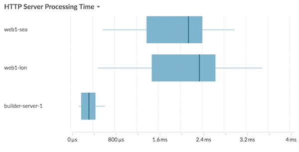
| Box plot chart | Displays variability for a distribution of metric data. Each horizontal line in the box plot includes three or five data points. | Distribution |
| Candlestick chart | Displays variability for a distribution of metric data over time. | Distribution |
| Heatmap chart | Displays a distribution of metric data over time, where color represents a concentration of data. | Distribution |
| Histogram chart | Displays a distribution of metric data as vertical bars or bins. | Distribution |
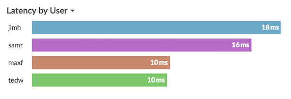
| Bar chart | Displays the total value of metric data as horizontal bars. | Total value |
| List chart | Displays metric data as a list with optional sparklines that represent data changes over time. | Total value |
| Pie chart | Displays metric data as a portion or percentage of a whole. | Total value |
| Table chart | Displays multiple metric values in a table, which can be easily sorted. | Total value |
| Value chart | Displays the total value for one or more metrics. | Total value |
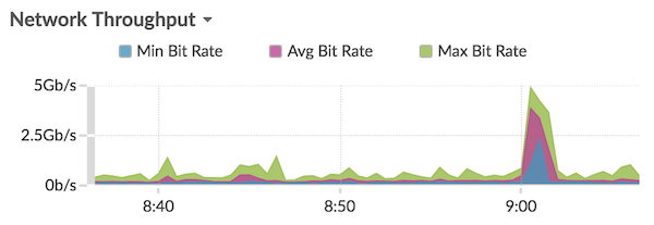
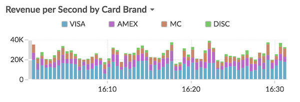
Area chart
Metric data is displayed as data points over time connected by a line, with the area between the line and the x-axis filled in with color.
If your chart contains more than one metric, data for each metric is displayed as an individual line, or a series. Each series is stacked together to illustrate the cumulative value of the data.
Select the area chart to see how the accumulation of multiple metric data points over time contribute to a total value. For example, an area chart can reveal how various protocols contribute to total protocol activity.
For more information about displaying rates in your chart, see the Display rates section.
| Note: | This chart supports detection markers, which indicate detections associated with chart data. |
| Note: | Machine learning detections require a connection to ExtraHop Cloud Services. |
The following figure shows an example of an area chart.
Bar chart
The total value of metric data is displayed as horizontal bars.
Select the bar chart when you want to compare the data for more than one metric for a selected time interval.
The following figure shows an example of a bar chart.
Box plot chart
The box plot chart displays variability for a distribution of metric data. You can only display data from dataset metrics, such as server processing time, in this chart.
Each horizontal line in the box plot includes three or five data points. With five data points, the line contains a body bar, a vertical tick mark, an upper shadow line, and a lower shadow line. With three data points, the line contains a vertical tick mark, an upper shadow, and lower shadow. For more information about displaying specific percentile values in your chart, see Display percentiles.
The following figure shows an example of a box plot chart.
Candlestick chart
The candlestick chart displays variability for a distribution of metric data over time. You can only display data from dataset metrics or high-precision network (L2) byte and packet metrics.
Vertical lines at each time interval displays three or five data points. If the line has five data points, it contains a body, middle tick mark, an upper shadow line, and a lower shadow line. If the line has three data points, it contains a middle tick mark. For more information about displaying specific percentile values in your chart, see Display percentiles.
Select the candlestick chart to view the variability of data calculations for a specific period of time.
The following figure shows an example of a candlestick chart.
Column chart
Metric data is displayed as vertical columns over time. If your chart contains more than one metric, data for each metric is displayed as an individual column or as a series. Each series is stacked together to illustrate the cumulative value of the data.
Select the column chart to compare how accumulation of multiple metric data points at a specific time contribute to the total value.
| Note: | This chart supports detection markers, which indicate detections associated with chart data. |
The following figure shows an example of a column chart.
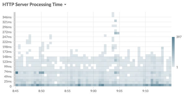
Heatmap chart
The heatmap chart displays a distribution of metric data over time, where color represents a concentration of data. You can only select a dataset metric to display in the chart, such as server processing time or round trip time.
Select the heatmap when you want to identify patterns in the distribution of data.
- The heatmap legend displays the color gradient that corresponds to the data range in the chart. For example, the darker color on the heatmap indicates a higher concentration of data points.
- The default data range is between the 5th and 95th percentiles, which filters outliers from the distribution. Outliers can skew the scale of data displayed in your chart, making it more difficult to spot trends and patterns for the majority of your data. However, you can choose to view the full range of data by changing the default filter in the Options tab. For more information, see Filter outliers.
- The selected theme, such as Light, Dark, or Space, affects whether a dark or light color indicates a higher concentration of data points.
The following figure shows an example of a heatmap chart.
Histogram chart
The histogram chart displays a distribution of metric data as vertical bars, or bins. You can only select a dataset metric to display in this chart, such as server processing time or round trip time.
Select the histogram chart to view the shape of how data is distributed.
- The default data range is from the 5th to 95th percentile (5th-95th), which filters outliers from the distribution. The minimum to maximum (Min-Max) view displays the full data range. Click the magnifying glass in the upper right corner of the chart to toggle between the two views.
- Data is automatically distributed into bins on either a linear or log scale based on the data range. For example, when the data range spans several orders of magnitude, data is placed into bins on a log scale. Min-Max (log) appears in the upper right corner of the chart.
- Click-and-drag to zoom in on multiple bins or a specific bin. Click the magnifying
glass again in the upper right corner of the chart to zoom out to the original view
(either 5th-95th or Min to Max).
Note: Zooming in to view a custom time interval does not change the global or region time interval. - Your toggle selection (between the 5th-95th and Min-Max views) will persist for your chart, but not for the users that you shared your dashboard and chart with. To set a persistent toggle selection before sharing a dashboard, see Filter outliers.
The following figure shows an example of a histogram chart.
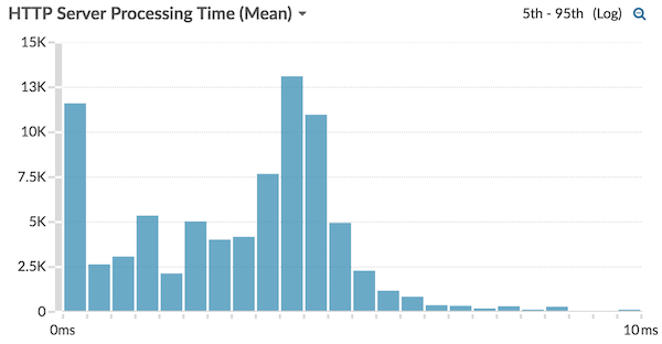
| Note: | This chart does not support baselines or threshold lines. |
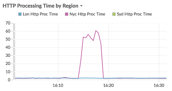
Line chart
Metric data is displayed as data points over time that are connected in a line. If your chart contains more than one metric, data for each metric is displayed as an individual line or as a series. Each series overlaps.
Select the line chart to compare changes over time.
| Note: | This chart supports detection markers, which indicate detections associated with chart data. |
The following figure shows an example of a line chart.
Line & column chart
Metric data is displayed as data points over time connected by a line, with the option to display a column chart underneath the line chart. For example, if your chart contains more than one metric (for example, HTTP Requests and HTTP Errors), you can select Display as Columns to display one of the metrics as a column chart underneath the line chart.
Columns are displayed in the color red by default. To remove the red color, click Options and deselect Display columns in red.
Select the line & column chart to compare different metrics at different scales in one chart. For example, you can view error rates and the total number of HTTP responses in one chart.
| Note: | This chart supports detection markers, which indicate detections associated with chart data. |
The following figure shows an example of a line & column chart.
List chart
Metric data is displayed as a list. Select the list chart to view long lists of metric values, such as detail metrics.
- Add a sparkline, which is a simple area chart placed inline with the metric name and value. A sparkline shows how data changed over time. Click the Options tab and select Include sparklines.
- Display the metric value in an alert status color. Different colors indicate the severity of the configured alert. For example, if an alert threshold is crossed for a metric that is displayed in the list chart, the value for that metric appears in red. Click the Options tab and select Color indicates alert status.
| Note: | This chart does not support baselines or threshold lines. |
The following figure shows an example of a list chart.
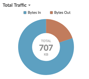
Pie chart
Metric data is displayed as a portion or percentage of a whole. If your chart contains more than one metric, data for each metric is represented as single slice, or series, in the pie chart.
Select the pie chart to compare the metric values that are mutually exclusive, such as status code detail metrics for the top-level HTTP Response metric.
- Display as a donut chart. Click the Option tab and select Show total value.
- Specify the decimal precision, or the number of digits, displayed in your chart. Percentile precision is useful for displaying ratios of data, especially for service-level agreements (SLAs) that might require precise data for reporting. Click the Options tab, and in the Units section, select Show percents instead of counts. Then select 0.00% or 0.000% from the drop-down list.
The following figure shows an example of a pie chart.
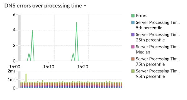
Status chart
Metric data is displayed in a column chart. The color of each column represents the most severe alert status of the configured alert for the metric. You can only select one source and metric to display in this chart.
To view the status of all of the alerts associated with the selected metric category, click Show Related Alerts. A list of alerts is then displayed below the column chart.
Select the status chart to see how data and the alert status for your metric change over time.
| Note: | This chart does not support baselines. |
The following figure shows an example of a status chart.
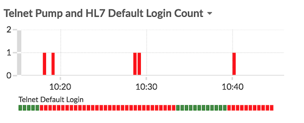
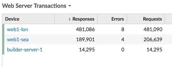
Table chart
Metric data is displayed across rows and columns in a table. Each row represents a source. Each column represents a metric. You can add multiple sources (of the same type) and metrics to a table.
| Note: | This chart does not support baselines or threshold lines. |
The following figure shows an example of a table chart.
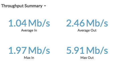
Value chart
The total value for one or more metrics is displayed as a single value. If you select more than one metric, metric values are displayed side-by-side.
Select the value chart to see the total value of important metrics, such as the total number of HTTP errors occurring on your network.
- Add sparklines, which is a simple area chart placed underneath the metric value. A sparkline shows how data changed over time. Click the Options tab and select Include sparklines.
- Display the metric value in an alert status color. Different colors indicate the severity of the configured alert. For example, if an alert threshold is crossed for a metric, the value appears in red. Click the Options tab and select Color indicates alert status.
| Note: | This chart does not support baselines or threshold lines. |
The following figure shows an example of a value chart.
Thank you for your feedback. Can we contact you to ask follow up questions?