Monitor website performance in a dashboard
When website performance slows down, knowing whether the issue is occurring at the application or network-level can save you troubleshooting time. In the ExtraHop system, a dashboard is an effective tool for monitoring real-time data, and for identifying and troubleshooting issues.
- How many requests are clients sending to my web servers?
- Are my web servers working properly?
- Is network availability affecting web applications?
- Is my network unusually slow?
Prerequisites
- Familiarize yourself with the concepts in this walkthrough by reading the Dashboards topic.
- You must have access to an ExtraHop system with a user account that has limited or full write privileges.
- Your ExtraHop system must also have network data with web server traffic. If you do not have access to web server data, you can perform this walkthrough in the ExtraHop demo.
Create a dashboard
When you create a new dashboard, the workspace opens in an editable layout mode with a single region and two empty widgets: a chart and a text box.
- Log in to the ExtraHop system through https://<extrahop-hostname-or-IP-address>.
- At the top of the page, click Dashboards.
-
Click the command menu
 in the upper right corner and select New
Dashboard to create an empty dashboard.
in the upper right corner and select New
Dashboard to create an empty dashboard.
- Type a name for your dashboard in the Title field. For this walkthrough, type Website performance.
- Click Create.
Configure your first chart
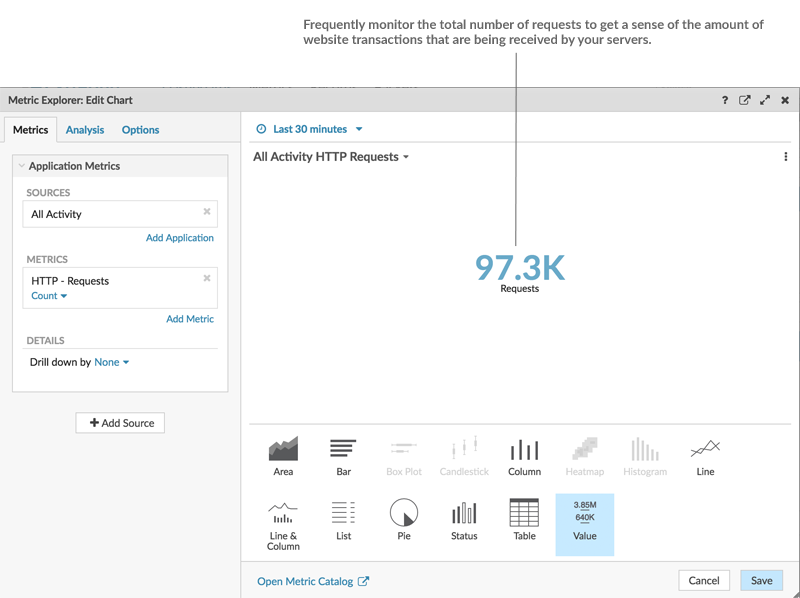
Your new dashboard contains an empty chart, which you will configure to display the total number of HTTP requests that were sent to your web servers. This step will help you understand how web transactions might affect website performance.
You will add more charts later, but these initial steps will show you how to add data to a chart by first selecting a metric source and then adding a metric in the Metric Explorer.
Because dashboards are often shared with members of a network team, you can add explanatory text boxes next to your charts. For this walkthrough, however, we will not be adding text, and you can delete the text box by completing the following steps:
- Click the command menu in the upper right corner of the text box widget
and select Delete.
- Click Delete Widget.
Customize the dashboard layout
When the dashboard is in layout mode, all dashboard components (regions and widgets) are available for you to drag and drop from the bottom of the dashboard page.
- Drag the corner of the dashboard workspace to make room for additional charts.
- Drag a chart widget from the bottom of the dashboard to the empty area of the top region
where the text box previously was.
Note: If there is overlap, dashboard components outline in red, and you must click and drag the sides of the widgets and regions to make room. - Drag a new region to the dashboard.
- Drag two more chart widgets into the new region.
- In each region header, click Rename to type a unique name for each region. For this walkthrough, rename the top region to Web and the bottom region to Network.
Add more HTTP metrics to your dashboard
Repeat the instructions provided earlier to configure the new empty charts. Continue to set your source to All Activity. This source ensures that all of the metrics you are observing are related to the same set of web servers.
The tables below outline the selections you should make for the metrics and chart types in each chart.
Charts in the Web region
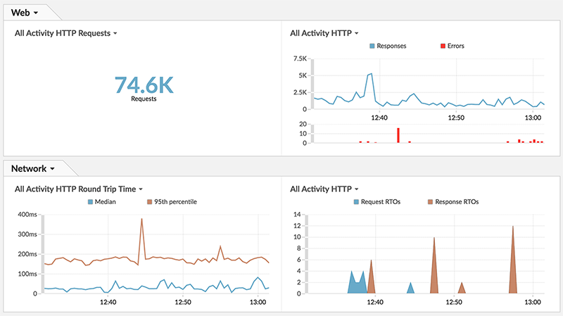
Chart 1: Determine how many requests your web servers are receiving. The value chart you already built lets you glance at the total number of client HTTP requests sent to your web servers.
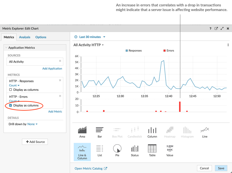
Chart 2: Determine if web servers working properly. The line & column chart shows you the relationship of 500-level status codes (server unavailability errors) to web transactions over time.
| What to Configure | What to Select |
|---|---|
| Source | All Activity |
| Metrics |
|
| Chart type |
|
Charts in the Network region
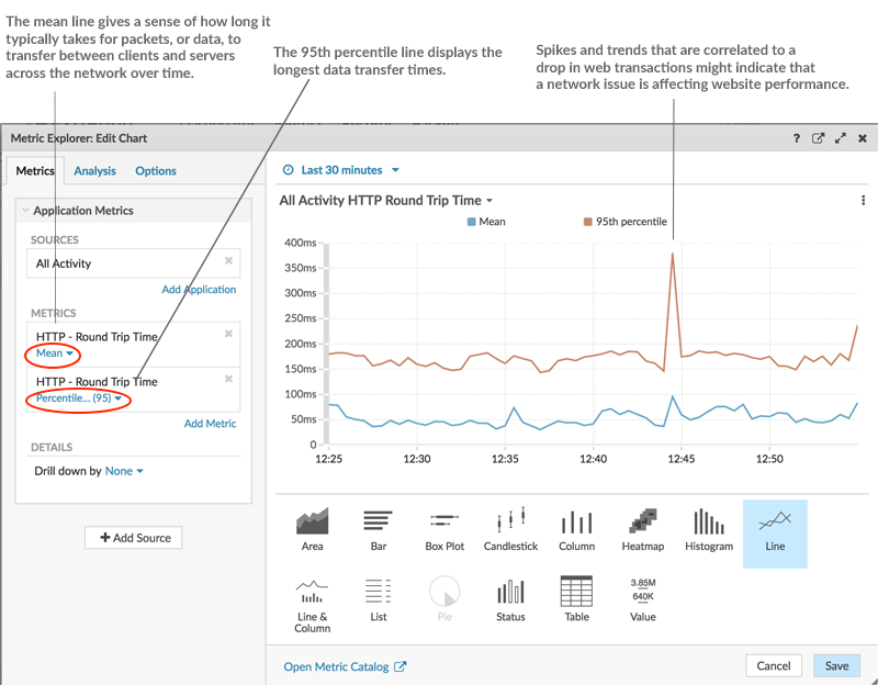
Chart 1: Determine if network availability is affecting web applications. A line chart will display how long it takes for data to cross the network (HTTP Round Trip Time). You will want to see the mean (50th percentile) and 95th percentile values for this metric, which requires adding the metric twice, as displayed in the following figure:
| What to Configure | What to Select |
|---|---|
| Source | All Activity |
| Metrics |
|
| Chart type | Line |
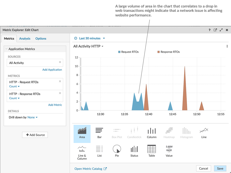
Chart 2: Determine if the network is unusually slow. The retransmission timeout (RTO) metric helps to identify packet loss and to locate the congested links. Because the combination of HTTP request and response RTOs can contribute to a slow website, correlate network retransmission timeouts to website performance in an area chart, as displayed in the following figure:
| What to Configure | What to Select |
|---|---|
| Source | All Activity |
| Metrics |
|
| Chart type | Area |
Monitor your website performance
After you have completed configuring all of the charts, click Exit Layout Mode. Your dashboard should look similar to the following figure. However, data in your dashboard charts will look different because your dashboard is reflecting the activity occurring on your network.
Thank you for your feedback. Can we contact you to ask follow up questions?